David OngYJ
DIGITAL MEDIA PRODUCTION

DESIGNS
Welcome to my Design Portfolio! Explore a fusion of innovative website designs, captivating posters, and striking graphic creations that reflect my passion for visual storytelling. Join me in this visual journey where each design piece is a testament to creativity and impactful communication. Enjoy the blend of art and design!


Jaya Grocer AngPow Design
AngPow Graphic Design
This was an AngPow Design Competition orchestrated by Jaya Grocer, exclusively tailored for art students of Taylor's University. Within this contest, we were granted the freedom to unleash our creativity and talents in conceiving a distinct Ang Pow packet design for the 2023 Lunar New Year, adhering to the evocative theme of "togetherness."
.png)

.png)
DYU SMART E-BIKE
Graphic Design
In this project, I undertook the creation of a product promotion poster. The product in focus needed to embody novelty, innovation, affordability, and practicality. My choice fell upon an E-Bike, aligning seamlessly with these criteria.
FUTURE MAGAZINE
Magazine Cover Design
For this artwork, I ventured into the realm of magazine cover design. Firstly, I delved into various magazine genres, ultimately choosing the dynamic landscape of fashion. With a meticulously curated cover concept in mind that encompassed color palettes, font selections, and design motifs, I embarked on constructing the cover page.


How fashion rules the world?
Magazine Featured Article Design
For this artwork, I created a captivating magazine featured article design. My exploration began by selecting the dynamic fashion magazine genre.

機械時代
Self-Portrait Design
For this artwork, I created a portrait of myself by applying the various design principles that I had learnt. I investigated both historical and contemporary forms of self-expression and also reviewed the design principles covered to better inform my particular direction.
Sense of Place
Digital Painting
For this artwork, I utilized and applied the design principles I have learnt to date in order to express a location of my choice. The place becomes the subject of the composition in which the design principles are applied to capture the social and environmental aspects, and even the time/s effects that will best express our intention/interpretation for a particular location.


5 Design Principles
Poster Design
For this artwork, I selected 5 design principles from the list below and then created 1 design for each chosen principle.
-
Gestalt theory
-
Contrast
-
Emphasis
-
Balance
-
Repetition
-
Movement
-
Harmony & Unity
-
Symbol
-
Word and Image
.jpg)
The Power of Photoshop
Photo Recoloring & Retouching
For this artwork, I brought black and white portrait photos to life with vibrant colors, showcasing my skill in using the Refine Edge Brush Tool after Select and Mask. I also delved into retouching, enhancing the model's skin to perfection—a digital form of makeup application using Photoshop.
Don't Suffer In Silence
Poster Design
For this artwork, I created an A4-sized poster with the theme of mental health.
Depression is a common mental disorder yet serious illness, and it can cause severe emotional, behavioral and physical health problems. Therefore, if you’re facing any problem or feeling hopeless, please do not suffer in silence and keep everything to yourself. You should find someone or Taylor’s Centre for Counselling Services to talk with. Please keep in mind that there is always someone willing to be your listener and supporter.
.png)
.png)
STAY HEALTHY
Reels Animation and Poster Design
For this artwork, I captured a self-portrait image, which I then seamlessly translated into a 9:16 aspect ratio poster. This standardized dimension is universally recognized across popular social media platforms such as Facebook, Instagram, and YouTube for stories and brief reels. Building upon this, I ingeniously transformed the poster into a captivating looped animation video, adding a dynamic layer to my visual storytelling.
THE DIGITAL COLLAGE
Digital Collage Design
For this artwork, I crafted a unique digital collage using a set of provided elements. Through this process, I gained insight into element utilization, precise cutouts with the pen tool, effective arrangement, and the application of the rule of thirds and golden ratio in Photoshop. Among three designs, I refined the most captivating one, employing Adjustment Layers and Filters to enhance my digital collage's impact and overall quality.
.jpg)


THE HOMICIDE
Comic Cover Page & Panel Design
For this artwork, I created an original comic pilot that showcases my illustration and visual narrative skills in the form of:
-
Cover page of your comic
-
One page introduction with animated panel(s)
Afterlife
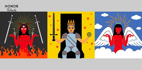
Digital Triptych Design
For this artwork, I created three illustrations (Digital Triptych) to depict a scenery of a story based on one of the themes. After that, I submitted my artwork for the HONOR Talents Global Design Awards Competition.
%20-%20Main%20Visual%20Design.jpg)
%20-%20Wallpaper.jpg)
%20-%20Personalized%20Card.jpg)
.png)
Vormator Challenge
Cartoon Character Design
For this artwork, I created my own unique design of character using a predetermined set of shapes. It allows me to show the ability to create a stunning piece within a strict set of rules.
Landing Page Design
For this work, I created a static landing page on a website based on the topic of my choice, Jovanka, a fragrance brand in Indonesia. The landing page should be able to communicate to the audience about the site's goal.
Working Landing Page Design
This is the extension from pt. 1.0. From a prototype to working website. In any given project for web development. It is to develop a microsite that we have proposed in pt 1.0. The website is fully functioned with a clear call-to-action.
Final Project Netlify link:
https://finalproject-davidongyongjian.netlify.app/
App Design
For this artwork, I created the KICK-CROBS mobile app design—a dynamic platform tailored to sneaker enthusiasts in pursuit of exclusive footwear. This innovative application serves as a seamless avenue for discovering and acquiring limited edition shoes.

FIRE, RING, TALL, & FREAK
Type Expression and Composition
For this artwork, I was given 4 words to compose and express. After sketching out ideas and choosing the best ones, there was a set of 10 typefaces (Adobe Caslon Pro, Bembo, Bodoni, Futura, Gill Sans, Garamond, New Baskerville, Janson, Serifa, and Univers) provided for the digitalization.
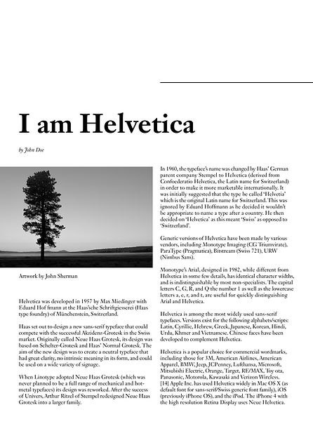
I am Helvetica
Type Formatting
For this artwork, I designed a final layout covering the text formatting elements, such as type choice, type size, leading, line length, paragraph spacing, forced line break, alignment, kerning, widows and orphans, and cross-alignment. Through this work, I increased my familiarity and capability with the appropriate software and developed my knowledge of information hierarchy and spatial arrangement.
.jpg)
.jpg)
THE IMPACT OF BAUHAUS ON MODERN CULTURE
Two-page Editorial Layout Design
In creating this artwork, I conveyed the essence of 'Bauhaus' through typography within a 2-page editorial spread (200mm x 200mm per page). While working within a set of guidelines, images were excluded, but the possibility of incorporating subtle graphical elements, like lines and shading, was considered.
make type great again!
Type/Font Design
For this artwork, I designed and created my own typeface that embodies the hallmarks of a good typeface: subtlety, character, presence, legibility, and readability. Below are the letters I designed: (a e t k g r i y m p n ! # , .). After completing the font, I designed a basic A4-sized poster to display my typeface.
Font can be downloaded from here:
https://drive.google.com/file/d/1xkFJ4F04DIiuBCSue2fF5hEVq_B2Ezpe/view?usp=sharing
.jpg)